Spire Space
An accessible app that helps seniors find inclusive city spaces, plan wellness activities and turn them into real, shared experiences.
Client
Thesis Project
DELIVERABLES
UX UI Art Direction Design Systems UX Strategy WCAG accessibility A/B testing 5W1H
Year
2025
Role
Art Director

Challenge
The main challenge was designing for a user group with a wide range of technological comfort, from confident smartphone users to people who had never used a touchscreen. This meant the interface couldn't rely on conventions that younger, tech-fluent users take for granted. Every interaction had to be intuitive on its own, without requiring prior digital literacy.
The goal was not to simplify the experience to the point of feeling clinical or "designed for old people." The priority was to create something that felt warm, dignified, and genuinely useful.
Another important challenge was the emotional weight of the problem itself. Isolation among elderly people isn't just a usability issue, it's a deeply human one. The interface had to lower the barrier to reaching out to others, make social connection feel effortless rather than effortful, and account for specific needs. Such as vision, motor control, & memory. Without the product ever feeling reductive or over-engineered.
Approach
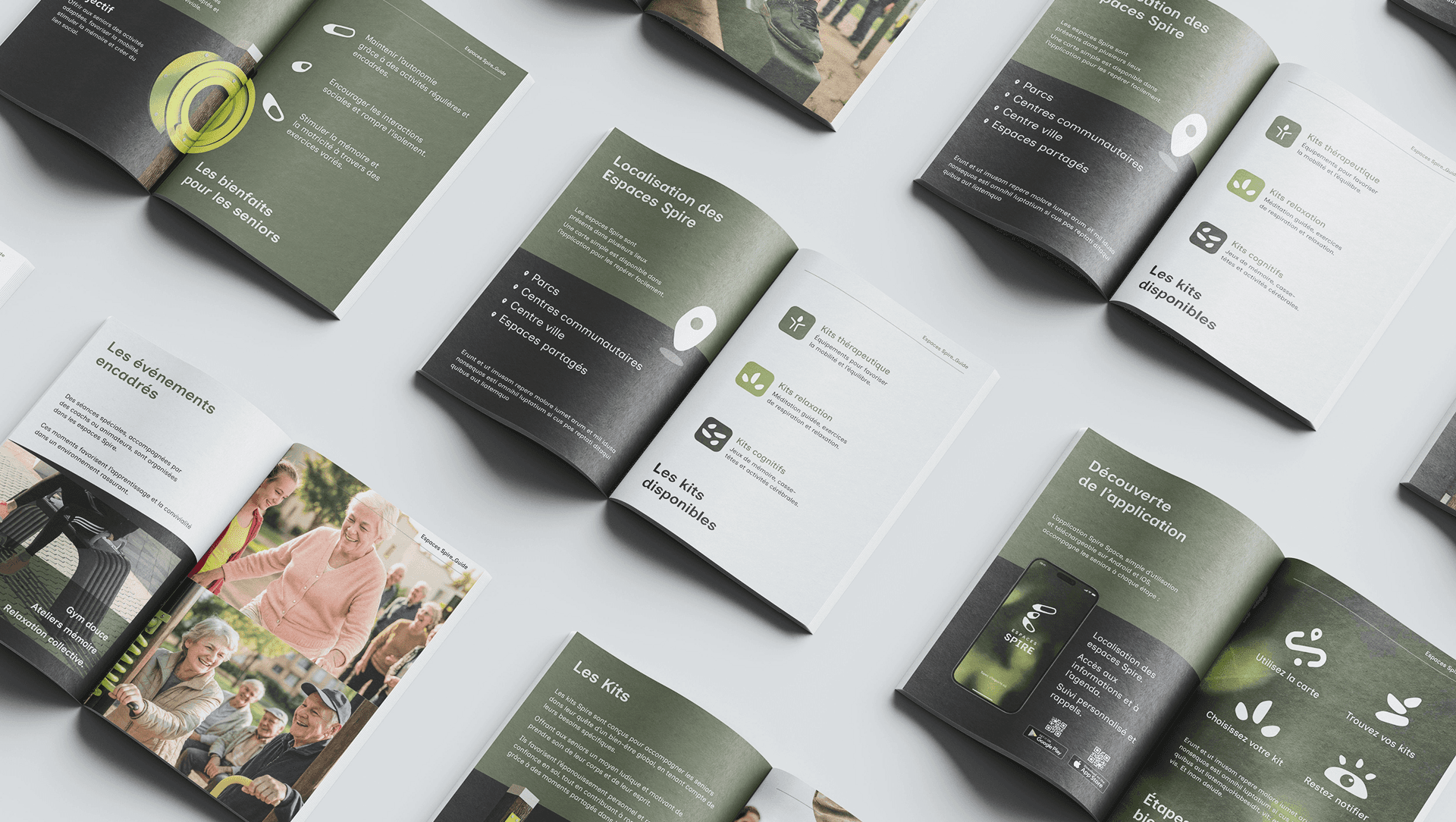
I started by understanding the needs of the target users. Rather than relying on assumptions, I had them locate and discover the physical and cognitive kits available through Spire Spaces, which let me see firsthand which ones were relevant.
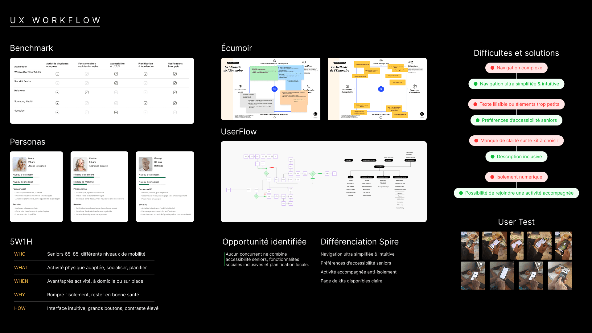
I built a research system that tackled: Benchmarking, Personas, 5W1H (getting to understand what matters, and to who), building a User Flow system, an Ecumoire (that allows the user and the designer to prioritize the most important elements of the app)
From there, I ran tests directly with users to observe how they interacted with the app, down to details like how they physically held the phone and used their fingers to navigate. This let me design the navigation to be as simple and intuitive as possible, built around how they actually held and moved through the interface rather than standard mobile conventions.
Outcome
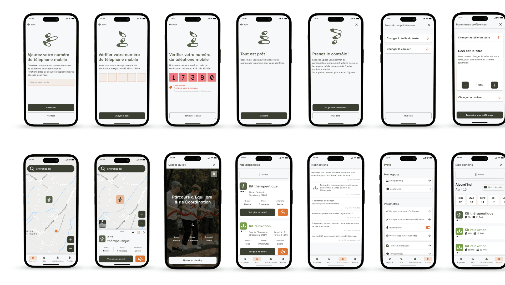
Each core difficulty was met with a targeted design decision. Complex navigation was simplified into a clear, minimal structure. Illegible text and small icons were addressed through a dedicated accessibility system, with icons designed to be unique, memorable, and easy to distinguish at a glance. The lack of hierarchy was resolved by structuring pages around clear priorities, so users always knew where they were and what to do next. Digital isolation was tackled directly by making it easy to join monitored, supervised events.
This translated into a set of key features: a simplified map, a custom icon system, and an Activity Hub with detailed pages for each Space and the kits available there. A notification system was built to fight isolation directly, sending cheering, encouraging alerts to keep users aware of what's happening around them. Alongside this, a planner gave users a sense of responsibility and something to look forward to, turning social connection into a habit rather than an occasional effort.
The result was an app that didn't just make navigation easier, but gave elderly users real reasons to stay engaged and connected.